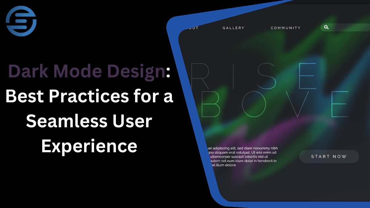
Dark Mode Design: Best Practices for a Seamless User Experience
Recent UI/UX design trends feature dark mode as a default option that allows users to find a comfortable interface for their visual perception compared to light themes. Dark mode is not only an aesthetic solution it increases readability, is beneficial for the battery in OLED screens, and has become a major push for better UX. In this article, let’s discuss the concepts of dark mode designing, following the principles of UI/UX design critical elements.
The Rise of Dark Mode in UI/UX Design
Having first appeared in such apps as Slack, Twitter, and Instagram, the dark mode has rapidly garnered a strong following and become a trend. About 81.9% of mobile users prefer UI/UX dark mode and would use it on their devices if it were available. For designers, this shift offers both challenges and opportunities: consisting of focusing on a readable design, adjusting the contrast levels, and helping with sustaining different types of consistency.
Key Advantages of Dark Mode Designing
- Enhanced Visual Ergonomics: Being able to switch the backlight to black and white reduces eye strain through constructing comfortable points of view as compared to the traditional bright screens that offer white light mainly in areas of low light.
- Battery Efficiency: Dark pixels require less power than bright ones and that is why OLED & AMOLED displays are power-friendly.
- Aesthetic Appeal: Light visualization is used by many users because it helps them achieve a more productive and optimal view of the interface.
Best Practices for Dark Mode UI/UX Design
Here are the best tips, when designing the dark mode:
1. Prioritize Readability with High Contrast Levels
Another goal of designing the dark mode is all about contrast, which is crucial for readability. When the contrast density is low, reading some text may become tough, especially if they are small fonts, whereas high contrast density of images or anecdotes may cause eye strain.
Use gray backgrounds instead of pure black:
Even though the ‘real black’, which is #000000 can cost less battery than other colors, especially when displayed on the OLED screen, it might be rather damaging to the eyes. This puts an end to that noise, choosing dark gray (#121212) or any tone that is closer to this minimizes the good effect.
Avoid pure white text:
In other words, while making text, avoid using neon pure white color as your text color, choose an off-white such as #E0E0E0. This minimizes eye stress, it makes the texts clear with no struggle for one to comprehend.
2. Preserve Consistent Brand Colors
Usually, when turning on UI/UX dark mode, brand colors may require small changes to display the right colors. This is because; color combinations that are okay when applied on a light background may be too bright or too dark on a dark background hence making the interface less usable.
Test and adapt color palettes:
Curtailing color brightness and saturation in the dark mode maintains consistency. It is particularly important not to use neon colors because placed on a dark background they cause some disturbing color oscillations.
3. Consider Accessibility in UI/UX Dark Mode
This accessibility approach should extend to dark mode as well since it is a part of the UI/UX designing process. For disabled users who have issues with color differentiation or eyesight, dark mode should still be applicable.
Provide adequate contrast:
WCAG says that there should be at least a 4.5 to 1 color contrast ratio for regular text and a 3 to 1 contrast ratio for big text.
Offer color customization:
Provide customization where a user can switch between the light mode or let them have more options for shading levels possible for the dark mode.
4. Incorporate a Smooth Transition Between Light and Dark Modes
Incorporating a UI/UX dark mode entails a smooth and fluid shift from a light mode interface to a dark mode interface. This is because, for applications where the user needs to switch between the two modes, this feature will prove quite useful.
Use animations or gradual transitions:
Using fade transition between modes allows users to create a transition that gives a smooth transition between brightness levels without a drastic change.
Ensure visual consistency:
Design elements should be useable in the same way and be in a similar position in both modes so that the user does not get confused.
5. Avoid Heavy Shadows and Overlays
Contrary to this, dark mode does not need heavy shadows or some kind of overlay because darkness automatically provides depth. However, if you prefer diffuse lighting, use shadow and glow that are balanced and fall in harmony.
Minimal shadows:
It’s advised not to have drastic lighting as it might affect the beauty of dark mode. Adjustable and blurred shadows provide the required prominence to the hierarchy while not dominating the page.
Glows over shadows:
Do not use shadows here, use a slight glow to highlight important parts of the image, this is a stylish option suitable for UI/UX design in the dark theme.
Common Pitfalls in Dark Mode Designing
The following are the common challenges in dark mode designing:
1. Ignoring Environmental Adaptability
Perhaps one weakness with dark mode designing is the lack of attention paid to the environment when it comes to the users. Dark mode, however, is not ideal when used in fully lit environments, and there will be a problem with readability.
- Provide a manual toggle option: Even when an app supports automatic switching between light and dark modes, provide a button with which users can change it when the first mode is appropriate in the current circumstances.
2. Overemphasis on Contrast
Dark mode sometimes puts some contraction in the form of color which leads to eye fatigue. Hence making contrast balance is critical when it comes to UI/UX dark mode design.
- Use accent colors sparingly: On the more frequent buttons or icons, you need to use accent colors while the rest of the interface should remain less saturated.
Case Studies: Successful Dark Mode Implementations
Apple iOS
Apple first incorporated dark mode across iOS in 2019 and did it right, both in UI/UX design and setting a strong basis for other applications. The overall layout reflects Apple’s design policy of contrasting, yet still clearly readable terminology: dark grey background with off-white writing. A touch of the button toggles the UI/UX dark mode which makes the iOS dark theme one of the most user-friendly implementations.
Google Maps
Of this, Google Maps’ dark mode is smart and will change to the dark mode during the night to reduce eye strain. It makes designing dark mode functional from the environment, making the experience even better. There must be an optimal balance of color distribution because when switching to dark mode, map details are visible with no high contrast.
Slack
As is with most dark mode themes, Slack’s dark mode is easy to work with as the texts used do not strain the eyes. Slack uses off-white text on a dark gray background with color accents and a dark theme is friendly and easy to work with. Users can decide whether they want to operate the dark mode of the platform or not on their own.
Steps for Implementing a Dark Mode Design in Your Project
- Analyze your existing color palette: Start with your primary colors and see how they look when placed on a dark background and if necessary adjust what you see.
- Set contrast ratios for text and UI elements: Strive to balance as contrast ratio while ensuring it provides legibility without straining the eyes.
- Consider adaptive elements: Implement changes that have user preference or time-dependencies making the dark mode option seem even more useful.
- Test across devices and lighting conditions: This is all about testing; cross-browser checking is a way of ascertaining that the interface as developed is consistent over different environments.
- Gather user feedback: Before moving to further improvement, users’ reactions are useful at the initial stage. With constant updates with consumers’ feedback, a quality dark mode can be kept impactful and consistent.
The Future of Dark Mode Designing in UI/UX
Considering the present trend where the users are gravitating more towards it and the increasing need to cater to this aspect, it can be presumed that dark mode designing will continue to develop. It appears from emerging patterns that users prefer adaptive themes, which in this case shift depending on the time of the day or even the region. Further, when it comes to the dark mode in the UI/UX design, it is even possible to go for more customization where individuals to tweak as per their standards.
Why choose Evernect?
| Feature | Evernect (UI/UX Design) | Competitors (UI/UX Design) |
| Customization Level | High, tailored to user needs and business goals | Moderate, often use pre-built templates for speed |
| Technologies Used | Figma, Adobe XD, Sketch | Adobe Photoshop, InVision (less focus on functionality) |
| Project Duration | 2-4 Weeks for basic designs, 6-8 weeks for complex | Generally faster but lack in-depth custom designs |
| Client Involvement | High, collaborative approach with regular feedback | Less client interaction may provide limited feedback loops |
| Post-Launch Support | Ongoing support, optional improvements, and testing | Limited post-launch support, often paid add-ons |
| Pricing | Transparent and flexible pricing models | Can vary widely, often higher or hidden costs |
| Unique Value Proposition | Focus on seamless user experience and conversion rates | Standard user interface designs with less focus on UX |
Conclusion
With dark mode receiving broad acceptance in UI/UX design, there is no overstating the need for a good approach. In addition to these, there is a set of guidelines you can follow to achieve increased usability: readability, color consistency, accessibility, and transitions—these principles will make your dark mode look both aesthetically pleasing and functional. Lastly, there is one crucial principle that works behind every good dark mode design—users’ preferences and harmonious combination of convenience and esthetics should dictate whether the dark mode is chosen or not.